Retail and hospitality lighting · 20 September 2025 · 8 min read
Retail lighting for merchandise and dwell time
How to light Australian shops so colour, vertical illuminance and glass cabinets help people stay and buy, rather than flatten the stock or glare the till.
By Elise Tan, Principal lighting designer, Sydney, New South Wales
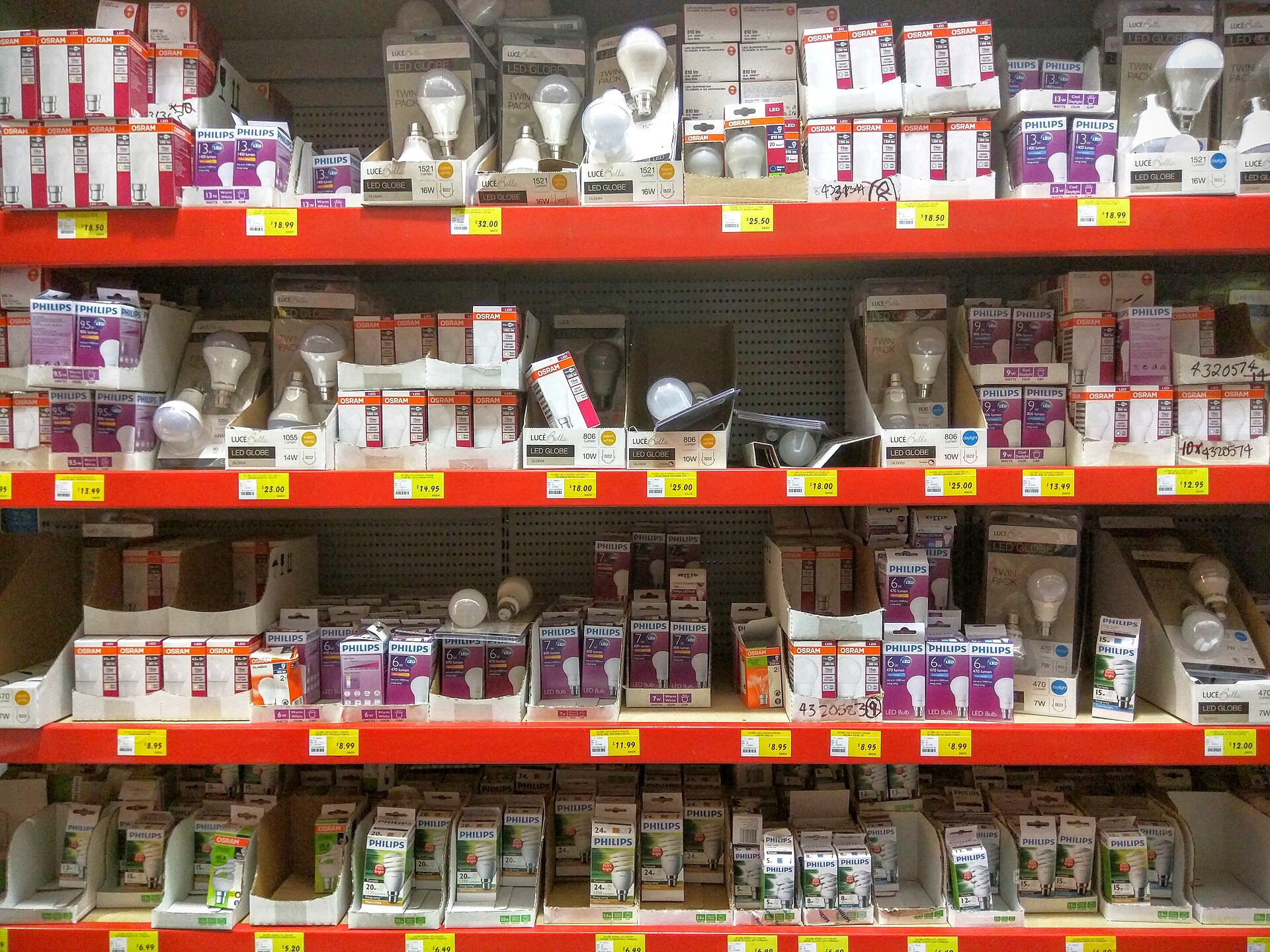

Retail lighting in Australia is still sold as “experience”. Walk a new specialty shop in a Sydney or Melbourne centre and you will hear the same sentence: warm, layered, Instagrammable. That sentence does not tell a contractor where to aim a track head, and it does not tell a merchandiser why the navy knit looks black after lunch. Light in a shop is a visual task. The task is the stock, the ticket and the face of the person behind the counter. Dwell time is a consequence of that task being easy, not a mood board.
This essay is a working method for merchandise lighting. It sits on the retail and hospitality hub beside supermarket fresh-food lighting, hospitality rooms and automotive showrooms. Colour science belongs in CRI and TM-30. Energy still sits under NCC Section J. If you came from the old product catalogue that once lived on this domain, the fittings have changed. The need to name the merchandise has not.
Name the merchandise, not the vibe
AS/NZS 1680 will not write your brand book. It will stop you treating a jewellery counter, a hanging rail and a circulation aisle as one maintained number. Open the current edition and the retailer’s visual merchandising guide before you pick a lumen package. Then write three planes:
- The floor and the main aisle, which only need people to walk without tripping.
- The vertical face of the stock — gondolas, hanging garments, wall bays, mannequins.
- The horizontal work of the till, the wrap bench and any inspection of small goods.
Most failed shops are over-lit on the floor and under-lit on the vertical face. A false-colour plan that looks heroic on the slab can still leave a navy coat looking like a silhouette. Customers do not buy the carpet.
Dwell time is not created by dimming until the room feels expensive. People linger when they can read a size label, judge a colour against their own skin, and not be stabbed by a downlight every time they look up. A dark boutique with one theatrical spot on a mannequin photographs well and sells poorly once the first customer needs to compare two similar jackets.
Vertical illuminance is the merchandise number
Specify maintained vertical illuminance on the actual display plane. For a hanging rail that is 1.2 m to 1.8 m above the floor. For a gondola, it is the front face of the shelf, not a calculation grid floating in the aisle. For a mannequin, it is the torso and the face of the form. If the software only reports the floor, you are specifying a car park.
Aiming matters more than wattage. A track head with a 15-degree beam can model a knit beautifully if it hits the fabric and misses the customer’s eyes. The same head, aimed five degrees too high, becomes a glare source that shortens dwell because people look away. Write aiming angles in the shop drawings. Require a night mock-up with real stock, not a cardboard box.
Contrast sells. A slightly lower ambient with a modelled highlight on the hero product still works in Australian specialty retail. A 1:1 wash that makes every SKU equally bright makes nothing look chosen. The mistake is chasing contrast with a tiny, over-lumened source that punches a hole in the ceiling grid and leaves a dark canyon beside it. Model the bay, then the hero, then the aisle.
Colour is a stock-keeping decision
Fashion, cosmetics, paint chips and fresh flowers are colour-critical. A “90 CRI LED” sticker is not a colour specification. Read CRI and TM-30 and then mock the actual range. A spectrum that flatters a warm camel coat can make a cool white shirt look dirty. A high-fidelity lamp that is slightly green in the reds will kill lipstick and tomato display in the same centre.
Correlated colour temperature is not a personality. 2700 K in a fashion boutique can look rich at 7 p.m. and jaundiced at noon next to a sunlit mall atrium. 4000 K copied from an office tenancy will make timber look cheap and skin look tired. Decide the adjacent daylight, the brand palette, and whether the shop must share a mall colour language. Then lock a CCT and a chromaticity tolerance, not a marketing adjective.
Metamerism still exists. Two navy fabrics that match in the stockroom can split under a narrow-band LED. If the retailer does colour matching on the floor, give that bench a known source and keep the feature track off it.
Glass cabinets are a glare problem
Watches, cosmetics and electronics live behind glass. Tight-beam spots aimed at the door produce a reflection of the ceiling and the customer’s face. The stock disappears. Staff then tape tissue inside the case or leave the door open.
Light the goods, not the glass. In-case linear sources aimed at the rear beat a ceiling grid that treats the cabinet as a floor patch. If you must use track, place the heads so the bounce misses a person standing 600 mm off the glass, eyes at about 1.5 m. Walk that position at night. A daytime commissioning with the roller door up is theatre.
Polished stone and mirrored columns do the same job as cabinet glass. If the interior designer has ordered black granite, your catalogue UGR table is fiction. Our method in open-plan Australian workplaces applies, except the “screen” is now a glass counter and a phone in every hand.
Layers that a contractor can build
A usable retail brief has three layers with named scenes, not a single dimmer:
- Ambient: a low-glare wash that makes faces and circulation readable. This is the layer Section J will notice first.
- Merchandise: track, wall-wash or in-case light aimed at stock. This is where vertical lux and colour live.
- Feature and brand: pendants, coves, window sparkle. Allowed, but not in the primary viewing angle of the till or the hero bay.
Controls should be DALI or an equivalent addressable system with a day scene, a late-trading scene and a cleaners’ scene. Absence detection in a stockroom is easy. Occupancy that plunges a sales floor to 10 per cent while a customer is still in the fitting room is how you earn a complaint. Window displays need a night scene that does not flood the footpath — that is an outdoor and civic problem as much as a shop problem, and it sits next to facade lighting and neighbour spill.
Energy without flattening the stock
Section J will cap the installed lighting power density whether the merchandiser likes it or not. The way through is not a harsher high-output downlight. It is fewer wasted lumens on the floor, tighter beams on the stock, and a scene that does not run a Sunday window at Saturday-lunch output. Write a maintenance factor. Dusty track in a homewares barn is not a sealed cosmetic case. Specify a replacement module; LED colour shift will quietly ruin a mocked spectrum.
What to write in the specification
Steal this structure and then edit it:
- Name the standard edition, the landlord’s mall guide, and any centre curfew on window lighting.
- Name each merchandise category and the maintained illuminance on a stated vertical or horizontal plane.
- Name colour: CCT, chromaticity tolerance, CRI and TM-30, with a mock-up clause for colour-critical stock.
- Name glare and glass: observer positions at cabinets, tills and fitting-room mirrors.
- Name scenes, hours and the Section J power budget so value management cannot “solve” merchandising by adding wattage.
Measurement and the mistakes we keep seeing
A single lux reading in the aisle is a postcard. Use a cosine-corrected meter, a vertical target on dressed stock, and note whether the mall atrium lights were on. Sit where a customer compares two garments. Tilt a phone at the cabinet glass.
The usual defects: copying 750 lx from a European handbook and failing Section J; lighting the floor and missing the hanging goods; treating RGBW as colour rendering; aiming every track head at the glass; ignoring the fitting-room mirror, which is where the sale is decided.
Retail lighting will not make those decisions for you. It will stop you pretending a vibe is a specification. Light the stock, hide the source from the eye that has to judge it, and let dwell time follow.
Questions readers ask
- Is a high CRI enough for fashion and cosmetics?
- CRI is a start, not a finish. Ask for TM-30 fidelity and gamut as well, and mock the actual stock under the proposed spectrum. A Ra 90 lamp can still make navy look black or foundation look grey.
- Should I design retail to horizontal lux on the floor?
- No. Customers look at hanging garments, gondola faces and glass. Specify vertical illuminance on the merchandise plane and keep the floor as circulation, not the brief.
- Why do glass cabinets look worse after an LED retrofit?
- Tight-beam spots aimed at the glass, not the goods, turn the door into a mirror. Move the aiming, raise the shielding, and treat reflections as a glare problem, not a merchandising problem.
More in Retail and hospitality lighting
- Hospitality lighting for restaurants and hotels
Dining scenes, commercial kitchens, guest rooms and night-time neighbour light — a practical method for Australian hospitality rooms that still have to pass inspection.
- Supermarket fresh-food and aisle lighting
Aisles, fresh-food spectrum, refrigerated cabinets and the energy arithmetic that survives a night fill in an Australian supermarket.
- Automotive and showroom lighting design
How to light car paint, glass and ceiling grids in Australian dealerships without glare, and how to run a honest after-hours security scene.