Design and specification · 2 August 2025 · 8 min read
Colour temperature, CRI and TM-30 explained
What CCT, CRI and IES TM-30 actually measure, where they mislead, and how to write them into an Australian commercial lighting specification.
By Elise Tan, Principal lighting designer, Sydney, New South Wales
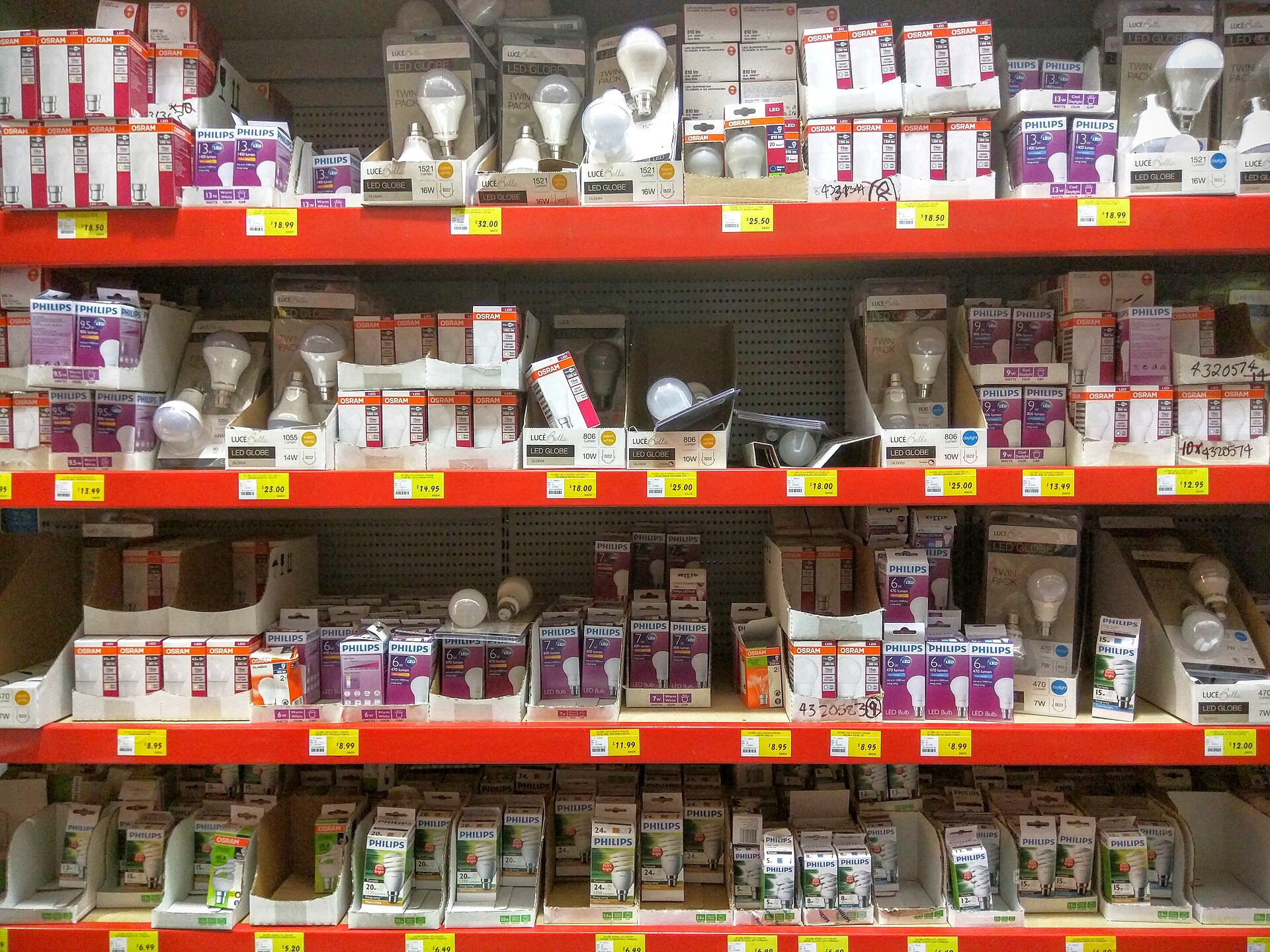

Correlated colour temperature is a single number that people treat as a personality. CRI is a score that people treat as a moral grade. TM-30 is a method that people treat as optional because the datasheet did not have a pretty badge. None of those habits is a specification. This essay is the working language I use on Sydney interiors when the brief says “nice white” and the procurement form says “LED”.
It sits in design and specification. Pair it with AS/NZS 1680 — colour is one of the things 1680 expects you to notice — and with how to write a spec so the words become enforceable.
CCT is a line on a diagram, not a feeling
Correlated colour temperature (CCT) places a light source near the black-body curve and reports a kelvin number. 2700 K is the familiar warm-white of old halogen. 3000 K is hospitality and many healthcare night scenes. 3500 K is the compromise Australia under-uses. 4000 K is the default commercial office. 5000 K and above show up in industrial, some clinical, and in the hardware aisle when someone grabbed the wrong carton.
Two 4000 K products can still look different. Duv — the distance from the black-body locus — decides whether the white sits green, pink or neutral. A slightly green 4000 K next to a slightly pink 4000 K is the striped ceiling you see after a relamp with mixed batches. Write a CCT and a Duv or a MacAdam / SDCM ellipse. “4000 K LED” is how floors become patchwork.
CCT also shifts with dimming, age and heat. Cheap boards go green or grey. In a Darwin plant room the shift arrives sooner than in a filtered Melbourne office. See climate. Specify a rated life, a colour-maintenance category, and what happens when a board is replaced: same bin, or accept a campaign replacement.
Do not chase “daylight 6500 K” in an interior unless the task is colour-critical and the occupants have agreed to live with it. High CCT with high glare is a migraine machine. Inclusive design and neurodiverse workplaces need a stable, dimmable white more than they need a dawn simulation. See accessible lighting.
CRI tells you a little, politely
The general colour rendering index, Ra, averages special indices R1 to R8 — a pastel set. It was built for a different generation of sources. It can hide a red that collapses (R9 is the usual missing villain) and it can score a source that still makes faces look tired.
Ra ≥ 80 is the commercial default in Australian offices and the number many Section J and procurement templates still expect. It is not enough for:
- Food retail and hospitality where meat, produce and wine must look like themselves. (The old storefront on this domain already knew that meat under the wrong LED looks wrong.)
- Fabric, print, paint and brand reviews.
- Clinical skin, dental and some aged-care assessments.
- Any room that will be photographed for the annual report.
If you only write Ra, also write R9 when red matters, and look at the source. Better: stop pretending CRI is the whole conversation.
CRI also does not measure preference. A high-Ra source can still be dull. A lower-Ra source with a cheerful gamut can sell a tomato and lie about a fabric. That is why TM-30 exists.
TM-30 is a picture plus two numbers
IES TM-30 (the current TM-30-18 / TM-20 family, labelled when you use it) evaluates a source against 99 colour samples. It reports:
- Rf, a fidelity index. 100 is a close match to the reference at that CCT.
- Rg, a gamut index. 100 is a similar average saturation. Above 100, colours generally pop. Below, they grey out.
- A colour vector graphic that shows which hues are amplified or suppressed.
That graphic is the useful object. Two sources with Rf 85 and Rg 102 can treat red-green skin opposite ways. For an Australian workplace I ask for the graphic on anything in reception, hospitality, food, healthcare, or a brand floor. For a back-of-house batten I will accept Ra 80 and a sane CCT if the rest of the spec is tight.
TM-30 is an IES method. Our editorial standards say we label overseas documents. I still use it because it is the best widely available language for LED colour. CIE and Standards Australia conversations continue; until an Australian clause replaces it, write the method name and the edition on the schedule.
How I translate TM-30 into a brief:
- Ordinary office, screens and paper: Rf in the mid-80s or better, Rg near 100, Duv near zero, 3500–4000 K.
- Faces and hospitality: watch the red and skin vectors; often warmer CCT; do not let Rg inflate unnaturally or people look sunburnt.
- Industrial inspection: fidelity first; gamut tricks hide defects.
- Night-time aged care: fidelity plus a warm CCT; no colourful “stimulation” scene.
If a supplier cannot produce TM-30 from a test report, they can still produce a spectral power distribution. A designer who cares can run the calculation. A supplier who refuses both is selling a mystery.
Australian applications, room by room
Offices. 4000 K remains the landlord default in Sydney and Melbourne. I will use it on the open plan when the façade is cool daylight and the brand is neutral. I will drop reception and client rooms toward 3000–3500 K so the arrival does not feel like a dentist. Pair with glare control; a high-CCT sparkle in every laptop is not “crisp”, it is a complaint.
Education. Lecture halls and studios need fidelity on faces and on work. 3500–4000 K, high Rf, and dimming that does not shift green. See daylight — a 4000 K grid against a warm sunset on west glass is a colour fight the photocell cannot referee.
Retail and food. Do not copy the office number. Produce wants a spectrum that has been looked at on that product, in that case, under that finish. A single “retail 3000 K 90 CRI” line is better than 4000 K Ra 80 and still not a tasting.
Industrial and plant. Tom will care more about dirt and IP, but colour still matters on electrical identification, food hygiene and quality control. High CCT can help inspection and hurt night-shift comfort. Write two scenes if the plant runs both.
Healthcare and care. Day and night are different specifications. A bright, cool day scene and a warm, low night path are an inclusive requirement, not a gadget.
Exterior and civic. CCT becomes a planning and ecology conversation. That is another essay. Do not take the office 4000 K onto a park path by laziness.
Tunable white is a control problem
A tunable fitting is two specifications in one body. You must name the range, the endpoints’ quality (TM-30 at 2700 K and at 5000 K are often not equal), the default scene, and who may change it. A DALI tunable job without a locked day scene will drift to whatever the last curious person set. Energy models that assume a dim, warm night and then get a cool 100 per cent all evening will miss NABERS and TCO.
I rarely use tunable white as a circadian medical claim. I use it when the room genuinely changes task: a council chamber that is a broadcast studio by afternoon, a gallery hold, a flex teaching bay.
What to put on the schedule
For each family:
- CCT, tolerance, Duv or SDCM.
- CRI Ra and, where relevant, R9.
- TM-30 Rf, Rg, and a requirement to submit the graphic for listed room types.
- Dimmed colour shift limits.
- Binning for replacements.
- A substitution rule: no “equivalent white”.
Measure on site with a spectrometer if colour is why the client paid you. A lux meter will not save a green floor. Compare against a kept sample, not against memory.
The hardware-store shelf in the hero image is the warning. Mixed cartons are how Australian commercial ceilings quietly go wrong. Specify the white, specify the method, and keep a spare from the same bin. If a TM-30 graphic changed a procurement decision on one of your jobs, write for us. We want the graphic and the sentence that convinced the superintendent, not a vendor rainbow.
Questions readers ask
- Is 4000 K the correct colour for an Australian office?
- It is a common workplace default, not a law. Receptions, healthcare night scenes and hospitality-adjacent rooms often want warmer. Match the task, the finishes and the daylight, then write a tolerance so the spare does not arrive at 5000 K.
- Is CRI 80 good enough?
- For many offices, yes, if glare and spectrum are otherwise honest. For colour inspection, food, fabric, clinical skin and brand photography, Ra 80 is a weak story. Use a higher Ra or, better, publish TM-30 Rf, Rg and the colour vector graphic.
- Does TM-30 replace CRI in Australian specs?
- Not yet in every procurement form. TM-30 is the more informative method. I write both for a transition period: a minimum Ra where the client’s template demands it, and TM-30 figures for anything that sells colour.
More in Design and specification
- How to write a commercial lighting specification
A structure for Australian commercial lighting specifications — scope, performance, substitution rules and hold points — that still works after value management.
- Daylight integration in Australian buildings
How to use daylight in Australian commercial buildings without glare, dead photocells or a Section J credit that the blinds quietly cancelled.
- Lighting for tropical, arid and temperate climates
Dirt, heat, cyclones and salt — how commercial lighting hardware and maintenance change between Darwin, Alice Springs and Hobart.