Standards and compliance · 6 May 2025 · 8 min read
Accessible and inclusive lighting design
Lighting for low vision, dementia and neurodiversity in Australian buildings, written against the Premises Standards context rather than a wellness brochure.
By Elise Tan, Principal lighting designer, Sydney, New South Wales

A lighting design that only works for a thirty-year-old with typical vision, a dark-mode laptop and a high tolerance for sparkle is not a completed design. It is a render. Australian law already knew this. The Disability Discrimination Act 1992, the Disability (Access to Premises – Buildings) Standards 2010, and the NCC access provisions are the public frame. AS/NZS 1680 is the visual-task frame. Neither document will invent empathy for you, but both will stop you treating inclusive lighting as a wellness extra.
This essay is a working method for workplaces, education, civic interiors and the healthcare-adjacent rooms that keep landing on my Sydney desk. It sits in standards and compliance because access is not a finish selection. If you came from a product page about “human centric” colour, read this first and the colour metrics second.
The Premises Standards context, without pretending it is a lighting handbook
The Premises Standards exist so new work and certain upgrades provide dignified access to buildings. They operate with the NCC and with AS 1428 on access and mobility. Lighting appears there as part of a safe, usable path: seeing a stair, a sign, a lift control, a face at a reception desk. The Standards do not give you a full interior-lighting specification. They do give you a reason you cannot shrug and say the brand wanted drama.
I treat that context as a minimum conversation:
- Can a person with low vision find the reception, the toilet, the exit?
- Are luminance changes along that path gradual rather than theatrical?
- Do signs and faces have vertical light, not only a pretty floor wash?
- Can someone who is sensitive to flicker, glare or noise from a driver use the room for the advertised time?
- If the occupant needs more light on a task, can they have it without flooding the neighbour?
If the answer is “the architecture is dark and moody”, the architecture is unfinished. Mood is allowed in hospitality. It is not a defence in a public foyer.
Low vision is a contrast problem as much as a lux problem
People with low vision are not a single user. Some need more light on the page. Some are disabled by glare that a typical occupant calls “bright and airy”. Many lose the edge of a stair that a designer lit as a floating sculpture. The useful moves are consistent:
- Even ambient light on circulation, with a uniformity you would be willing to measure. A 1680 average that hides a black pocket beside a window is a trip.
- Stronger contrast on nosings, desk edges and glass. Lighting cannot replace a contrast strip, but it can wash it out with a grazing beam.
- Vertical illuminance on faces and on information. Receptions and teaching walls are social equipment.
- Avoidance of bare, high-luminance apertures in the primary field of view. See glare control.
- Transitions: a dark lobby into a brilliant atrium is a pause, not a welcome. Step the light.
I still specify a maintained illuminance for the task, then I check the path between tasks. The path is where inclusive design usually fails.
Polished concrete, glossy tiles and glass balustrades are lighting materials. If the interior designer has already ordered them, your downlight grid is a reflection machine. Offset, soften, or change the finish. Do not “add more light” to a mirror.
Dementia-inclusive rooms hate false shadows
In aged care, memory-support units and some hospital wards, lighting is part of orientation. A dark patch on a pale floor can read as a hole. A bright stripe can read as a barrier. A flickering source can read as a threat. Night lighting that is only a blue-ish exit sign can pull people toward a door they should not use.
Practical rules I put on those jobs:
- High uniformity on floors, without theatrical grazing that invents stripes.
- Warm, stable colour at night; no clever colour-change that “stimulates” at 2 a.m.
- Night paths to toilets that are low but continuous, not a single glare-bomb sensor light.
- Windows treated as the brightest luminaire in the room, with shade the staff will actually use. See daylight.
- Controls that staff can operate in a hurry. A DALI scene named “night” beats a hidden app.
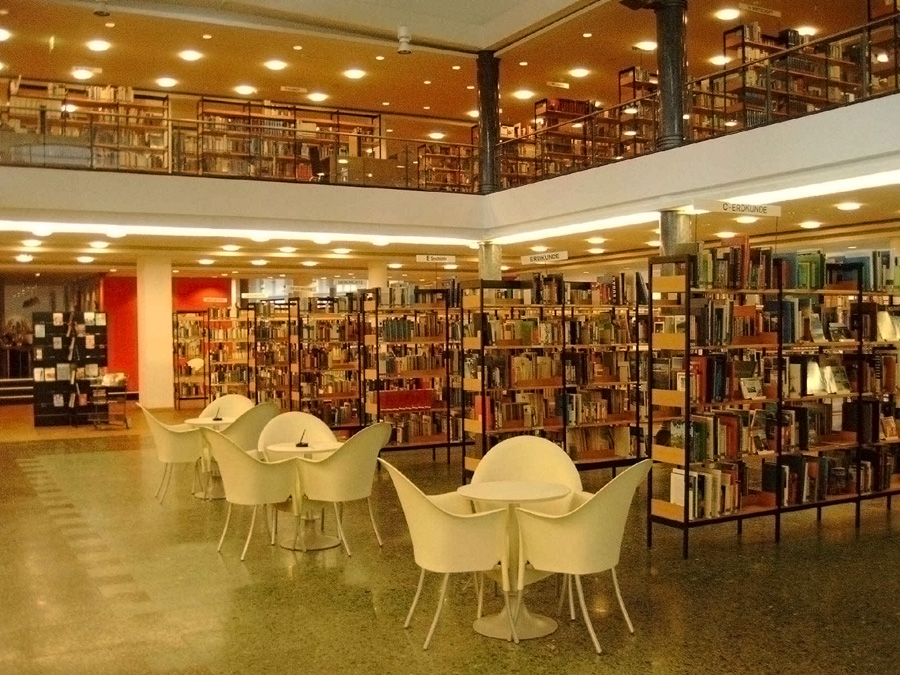
This is not only a care-sector problem. Any civic building that serves older Australians — libraries, councils, court waiting rooms — inherits a milder version. The reading-room photograph on this article is the right instinct: tables, faces, a ceiling that does not sparkle at the reader.
Neurodiversity, flicker and the right to leave a scene
Autistic occupants, people with ADHD, migraine, and a range of sensory disabilities ask for things lighting designers already know how to do and still forget: no flicker, no glare, a way to dim, a way to get out of an over-lit collaboration theatre. Open-plan Australia added glass meeting rooms and a culture of “energising” 4000 K at 600 lx. That culture has casualties.
Write into the brief:
- Driver flicker performance with a cited method, not a sticker.
- Acoustic note: some drivers buzz. The buzz is a lighting defect.
- Local dimming in focus rooms and a scene that is genuinely dim, not 80 per cent of the day scene.
- Absence detection that does not punish stillness. A person who reads without waving is still present. Marcus covers timeouts in DALI.
- Permission for a task light. Inclusive design is often an extra layer, not a louder overhead.
I do not sell a circadian narrative as an accessibility strategy. Spectrum can help some medical and shift-work conversations. It can also deliver a blue-rich glare. If you use tunable white, give people a stable scene they can keep.
Controls are an access feature
A lighting control the occupant cannot understand is a locked door. Wall plates need a readable on, a readable dim, and a location that AS 1428 logic would recognise — reachable, contrasted, not hidden in a black reveal. App-only lighting in a public room is a failure. App-plus-plate in a tenancy can be fine.
After-hours and security lighting should not turn a workplace into a cave with one blazing downlight over the security desk. That contrast is hostile for low vision and for anyone arriving tired. Use a low, even night scene.
Emergency lighting is access. A glare-bomb emergency batten in a stair, or an exit legend that vanishes against a bright wall, will be tested under AS/NZS 2293 for duration. Test it also with a human who is not twenty-five. Inclusive emergency is still emergency.
Climate and the Australian outdoor-to-indoor shock
A Darwin or Townsville entry in the wet season, a west-facing Perth foyer in January, a Hobart civic lobby in June — the adaptive jump is different. Inclusive design means the first ten metres inside do not demand an instant eye change the occupant may not have. Climate-specific hardware matters at the door as well as on the high-bay.
What I write in the specification
- Name the Premises Standards / NCC access pathway and AS 1428 references that apply to the building class.
- Name 1680 tasks, including circulation and reception as tasks, not leftovers.
- Name uniformity, glare method, vertical light on faces and signs.
- Name flicker, driver noise, and substitution bans that would reintroduce them.
- Name scenes, including a dim focus scene and a night path.
- Name a mock-up or a night walk with facilities and, where possible, occupants who were not in the design meeting.
Energy still applies. Section J and NABERS do not get a free pass because the room is inclusive. Good inclusive lighting is often less wattage wasted in glare and decorative sparkle, plus a little more where the task sits. That is a specification discipline, not a conflict.
If a clause you wrote failed a real occupant — a teacher, a juror, a resident — the write for us page is open. Inclusive lighting is one of the few topics where a single field note is worth more than a catalogue. We will edit it against the editorial standards and keep the wellness language out unless a clinician is in the byline.
Questions readers ask
- Does the Premises Standards set a lux level for offices?
- The Disability (Access to Premises – Buildings) Standards sit with the DDA and point you at access provisions, including those referenced through the NCC and AS 1428. They do not replace AS/NZS 1680. Use both. Inclusive lighting is a design duty, not a single number.
- Is more light always better for low vision?
- No. Glare, sudden contrast and glossy floors can disable a room that is numerically bright. Aim for even, controllable light with readable faces and edges, then add task light where the person needs it.
- Do flicker-free drivers matter if I cannot see flicker?
- Yes for a slice of occupants — migraine, autism, photosensitive conditions, and some older workers. Invisible flicker is still a specification item. Ask for the driver performance, not a marketing “flicker free” badge.
More in Standards and compliance
- AS/NZS 2293 emergency lighting testing and logbooks
How Australian buildings should test emergency lighting under AS/NZS 2293, keep a logbook that would survive an audit, and treat monitored systems as tools rather than a substitute for competence.
- NABERS, Green Star and lighting performance
How NABERS Energy and Green Star treat lighting power, hours and metering in Australian commercial buildings — and why a Section J model is not a rating.